| | | | TRIBE 03: REPUBLIC of TYPE
FRISCO_REMIX: L/l
Peter Lofting
Apple Computer Font Group
Cupertino, California
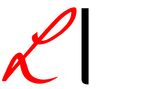
The two “L”s make an interesting study of extremes: In sans serif designs the lowercase “l” is often a homoglyph of digit “1” and capital letter “I”
| | so it has very little room to maneuver. On-screen it usually takes a pixel at lower right to claim its identity, but here for print it’s trying out an inverse base serif. The capital “L” is one of the most dynamic glyphs in the alphabet. The cursive form is a powerful figure“8” that can take any amount of flourish at its entrance and exit strokes and has an almost ballistic feel... an “L”-bow.
| |