| AIGA San Francisco presents
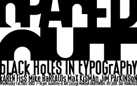
SPACED OUT. BLACK HOLES IN TYPOGRAPHY.
An evening with KAREN FISS, MICHAEL BARTALOS, MAX KISMAN and JIM PARKINSON on WEDNESDAY, OCTOBER 1, 2003 at 7 p.m. at the Academy of Art College’s MORGAN AUDITORIUM, 491 Post Street, San Francisco.
Tickets are $10 for AIGA members, $15 for non-members. STUDENTS RECEIVE FREE ADMISSION WITH VALID ID!
We also present FRISCO_REMIX, a sample font with contributions by 34 Bay Area typeface designers. FREE at www.hollandfonts.com until December 31, 2003.
Receive a FREE copy of the limited edition FRISCO_REMIX POSTER at the event and get the new type compendium INDIE FONTS 2 for the amazing and one-time offer of $20 ONLY!
To reserve your space with a credit card call the AIGA SF office at 415-626-6008 or send your check (made payable to AIGA SF) to AIGA SF, 1111 Eighth Street, San Francisco, CA 94107. Your name will be held at the door. Admission will also be available at the door, space permitting. | | Type design is a growing activity of graphic designers, and the purpose of this event is to give it extra exposure as a valuable and matured field. In the Bay Area, there are many designers who either specialize in type design, or else for whom designing type is an important aspect. Although local institutes have been hesitant with type design, the California College of the Arts starts an investigative studio in the spring 2004 semester.
With the constant mode of change and innovation going on, graphic design, typography and type design, will move along in fashion. The basic ingredient of written language, the alphabet, stays very much the same, but the way it looks, smells, tastes or feels, changes by the urgent need for new and different experiences.
Decentralization and individualization of the design process allows individual designers to produce high quality designs and identity programs.
Stating that the letterform is purely subjective – any letter could have looked completely different – the way we read forms is an endless landscape to explore. Typeface and symbol design offer essential tools for the designer. As much as photography, animation and illustration are an important part of the communication package.
| | Jim Parkinson (www.typedesign.com) designs typefaces and designs & restores logos. He works primarily for publications, was one of the designers of ITC Bodoni and has designed custom fonts for Rolling Stone, the National Post and the San Francisco Chronicle. Jim works and lives in Oakland, California.
Before moving to San Francisco, Michael Bartalos (www.bartalos.com) attended the Art Institute of Chicago and Pratt Institute and worked extensively in the graphic arts in the U.S. and Japan. His first children’s book, Shadowville, was published by Viking USA in 1995. His subsequent projects include the Marathon commemorative stamp for the U.S. Postal Service, Swatch watch designs, a Perrier bottle label design and the ”Bartalk” icon font for T-26 Digital Type Foundry.
Max Kisman (www.maxkisman.com) is based in Mill Valley, Calfornia. Born in the Netherlands, Kisman was a pioneer in digital technology in the mid-1980 and an award-winning designer whose work includes magazines, posters, television graphics and postage stamps. He teaches graphic design and typography at the California College of Arts and at the UC Berkeley Extension, both in San Francisco. |