Today, we easily create images by mouse clicks and keyboard shortcuts, in an almost natural and organic way. The machine is the extension for our ideas. The tool for our imagination. Although our imagination often won’t come “out of the machine” at all, I still do make myself belief that I “do it by hand.” And the images are as real as any framed picture on our walls.
How the assignment for the 1987 Red Cross stamps for the Dutch Postal Service turned into a design experiment.
<back
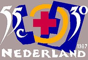
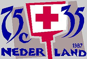
I made hundreds of designs for these Red Cross stamps: manually drawn, cut and pasted from photos or from colored paper and compiled in a bounded sketchbook, from which finally three clear designs were chosen. The collage images are surprising because they seem to revert to an illustrative design from the early sixties and especially to the work, for example, of the Dutch designers Dick Ellfers and Gerard Douwe or the American Saul Bass.
The cut-out elements were digitally drawn in a computer, in a way that I could freely experiment with. In TYP/Typografisch Papier (Netherlands, 1987) I wrote:
In a relatively simple way popular computers and systems are used by designers, where it is more often the designer and less often the technology that defines the image. The Red Cross stamps 1987 are an example.
Stamp designs of the last ten to fifteen years are characterized by a true excess of detail and by miniaturization. A complex visualization seems to create an illusion of great value. The fact that a stamp has communicative aspects often is ignored in stamp design. The effort the user has to take to get some understanding of the message often is overlooked. To break with this tradition, a different approach has been chosen for the designs of these Red Cross stamps.
The computer helps to further develop the already-made collages and sketches of the stamp designs with the many available design and drawing applications and gives a number of interesting graphic possibilities.
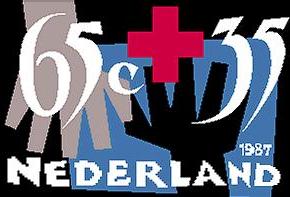
A recurring visual element, like the word “Nederland” can be, once made, stored. Every time it is needed it can be summoned. The computer is also very useful to the definition, balance and change of colors and color combinations. The stamps are designed to be printed in mixed colors in Pantone values. With the computer it isn't difficult to fill in the forms with black and the leftover visual elements with white. Thus the different masks for the color separations are made.
Collaboration with Joh. Enschedé Printers made it possible to produce of the design of the negative films for the prepress preparation in one straight line. Possibly for the first time in stamp design no paper mechanicals were used; direct diversions (negatives) of the designs were used instead. With the negatives Joh. Enschedé executed more lithographic preparations. The designs are strong enough to stand the experiment in this new technology. Without losing power in symbolism and illumination.
Fragments from Dutch postage stamps, 1987/1988. Postmarks, backgrounds, issue facts and designs. Compiled and introduced by Paul Hefting, 1988, SDU publishers, The Hague, The Netherlands. ISBN 90 12 05903